Blue Team Con Logo & Brand Use
Marketing Use
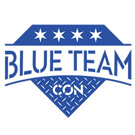
If you would like to use our logo, please use the exact logo as seen on our platforms and do not attempt to modify or change anything. Our logo must be used as is.
Blue Coloring
For print and screen purposes, please utilize the following color settings to replicate the Blue Team Con branding:
PRINT
CMYK: 93-78-0-0
PMS: 2728
SCREEN
RGB: 43-81-163
HEX: 2B51A3
Typeface
The official Blue Team Con typeface is Town 40 Stencil Medium. If you need access to this typeface, please contact us.
GitHub
Formats of our logos are accessible on GitHub at https://github.com/BlueTeamCon.
Artist Statement
The below is an artist statement provided by Melanie Warner (@1dark0ne), the creator of the Blue Team Con logo.
When Frank decided to hire me to design the logo for their inaugural Blue Team Conference, I had come recommended by clients and friends in the information security community. I don’t know what possesses people to give money to an invisible person they’ve never met, in hopes of receiving something that doesn’t exist, with no guarantee that it’s going to work. If there is a moral to this story, it is not that you should trust hackers, but perhaps that inconclusive social evidence isn’t as bad as it sounds.
He and his business partner thoughtfully answered all my questions about what the spirit of the Blue Team Con should be. We kicked off with a great phone meeting, and I got to sketching. My understanding of blue teams in the infosec world, combined with their insights, gave me guidance for what their new brand should and should not look like. There are plenty of red team-centric design clichés that we wanted to avoid, but there are plenty of positive symbols that can represent the important roles of information defenders and appsec engineers. Here’s a theoretical breakdown of the elements we chose.
1. Four, six-pointed stars
Since Blue Team Con will be held in Chicago, we looked at references to their fair city that would carry the logo into future iterations, knowing that the con could grow and be held in other locales. It’s significant to the con’s legacy for its logo to reference its roots without looking out of place when used elsewhere. We used the four stars from the Chicago flag, which represent major historical events that define Chicago and symbolize the city’s strength and fortitude.
2. Diamond-shaped shield
Despite the ubiquity of shields in infosec branding, it’s important to signal what kind of tech conference this is, especially when promoting it outside the context of infosec. A shield represents the defense and protection of information systems. This particular shield is shaped like the side view of a faceted diamond, and blue teamers strive to create systems that are tough like diamonds. This shape is also a subtle reference to the Superman logo, which is also shaped like a diamond. Blue teamers are good-guy superheroes who beat the bad guys.
3. Stencil lettering
To every red teamer whose job it is to break things, there are many more critical roles for the diligent and industrious blue teamer whose job it is to fix the things and build them better. There is a dogged humility to carrying on, away from the limelight and sex appeal of hacking. Actual stencil lettering gets the job done when there’s real work to do, when there’s no interest in window dressing. It reminds us of purpose-built machinery, defense systems, stoic brutalism, and the Industrial Revolution. Despite the symbolism of stark utility, the two fonts I used are based on well-designed typefaces. Form and function coexist.
4. Blue Team arched logotype
The central part of the logo is arched like a suspension bridge. Blue Team Con forges connections and strengthens bonds among people with a common interest. Together, we become stronger by sharing ideas and bridging our unique knowledge and experiences.
5. Diamond-plate steel pattern
This type of steel is known to be a reinforcement layer to any industrial application. If a blue team goal is to build an impenetrable firewall, this functions way better than a band-aid, both visually and metaphorically.
The whole is greater than the sum of its parts. The strength, simplicity, and inherent symbolism of the logo makes it recognizable, memorable, flexible, and durable. Technically, this logo design can be used in any size and in any form of reproduction. You never know all the places your logo will go, so it’s best to prepare it for anything.
A brand is a promise to uphold its values. Our hope is that anyone who encounters the Blue Team Con brand will feel confident that it’s the de facto conference where blue teamers can gain the most rich and relevant information for their careers. It’s a place where they’ll learn how to better protect their internal teams and clients from outside threats. It’s also a place where they’ll look forward to meeting like-minded individuals, making new industry contacts, and enjoying their time with familiar faces. Ultimately, we hope the conference will educate and inspire blue teamers near and far to be the superheroes the world needs.
I want to thank the true professionals organizing this groundbreaking conference for allowing me the privilege to introduce their brand to the world with a striking logo that will serve them for the exciting years ahead.